
Fidelity Bank
Overview
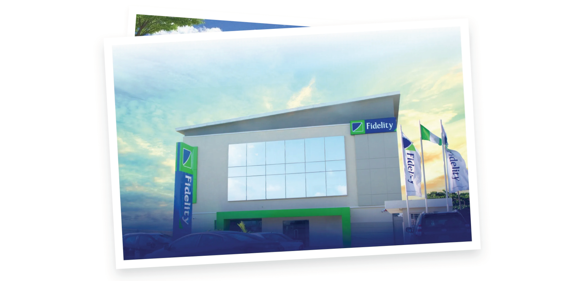
Fidelity Bank, a leading commercial bank in Nigeria, embarked on a strategic rebranding endeavor to refine its visual identity. Serving over 5 million customers through 250 business offices and digital channels, the objective was to create a compelling image that seamlessly blended the bank's rich heritage with a contemporary, vibrant outlook. This transformation aimed to reinforce the bank's commitment to quality service and a forward-looking perspective.
My contribution
Art Direction
The team
Year
2015
Approach
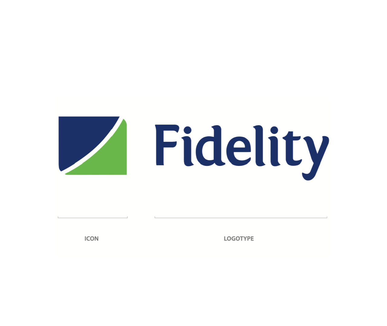
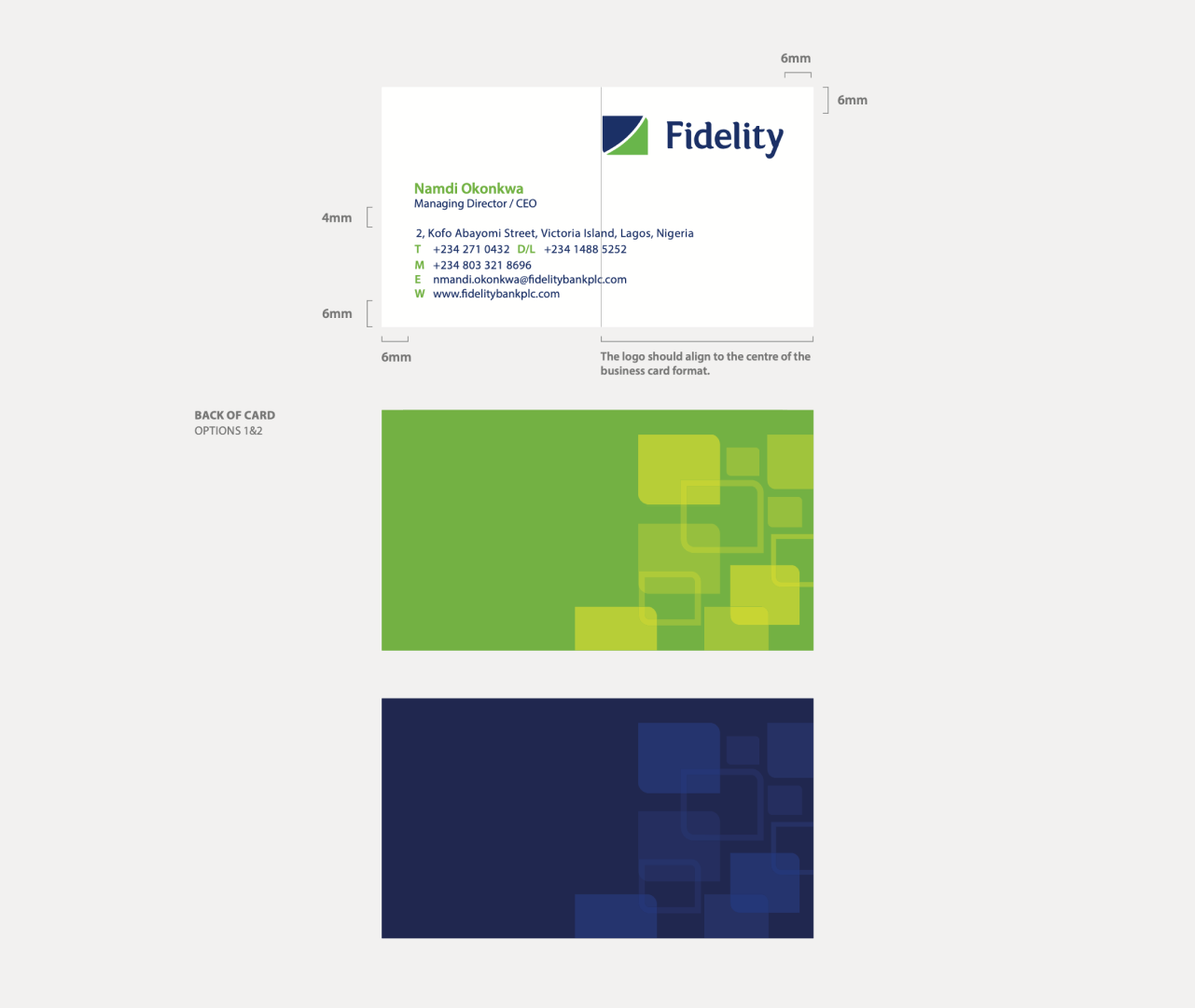
The Fidelity icon, symbolizing two arrow tips, intricately combines a blue arrow denoting heritage and maturity with a green arrow representing vibrancy and youthfulness. The logo, comprising the icon and logotype, stands as the foundation of Fidelity's identity, embodying the bank's essence and futuristic vision.
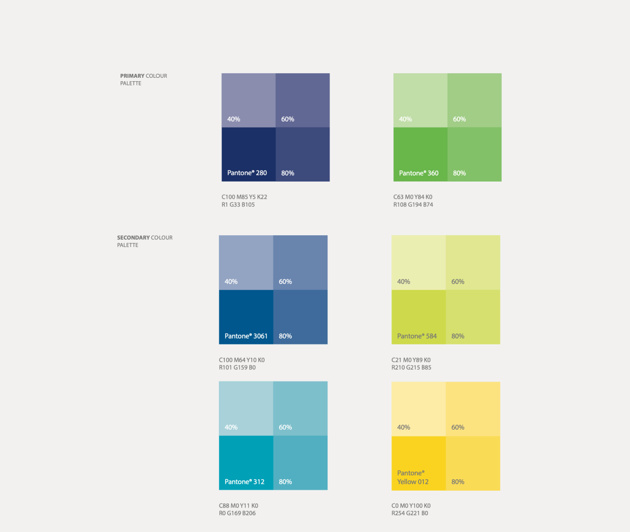
Meticulously chosen Pantone® 280 (Fidelity blue) and Pantone® 360 (Fidelity green) serve as primary colors, embodying the brand. The secondary palette, Pantone® 3061, Pantone® 312, Pantone® 584, and Pantone® Yellow 012, complements the primary hues, ensuring consistent brand representation.
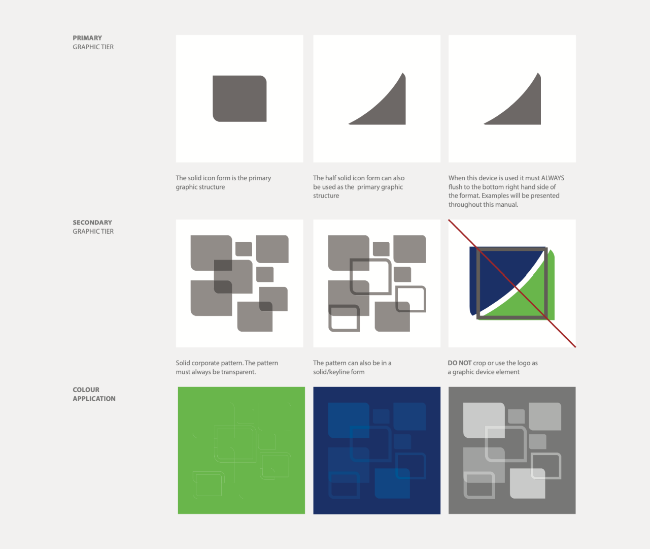
Derived from the icon, the graphic device serves multiple roles, acting as a solid holding shape and a repeat corporate pattern. Its adaptability allows for both solid and keyline applications, maintaining a unified brand aesthetic.
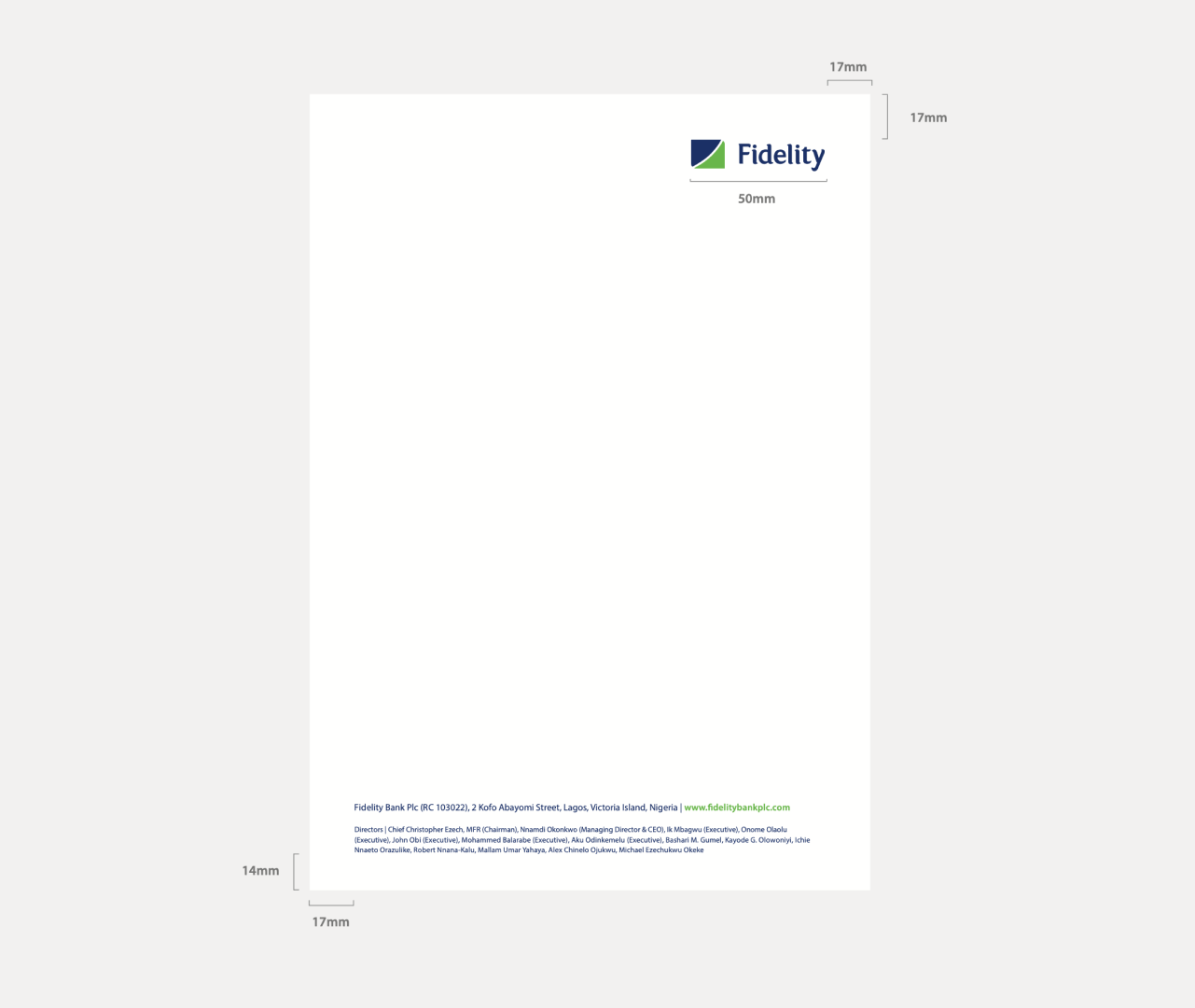
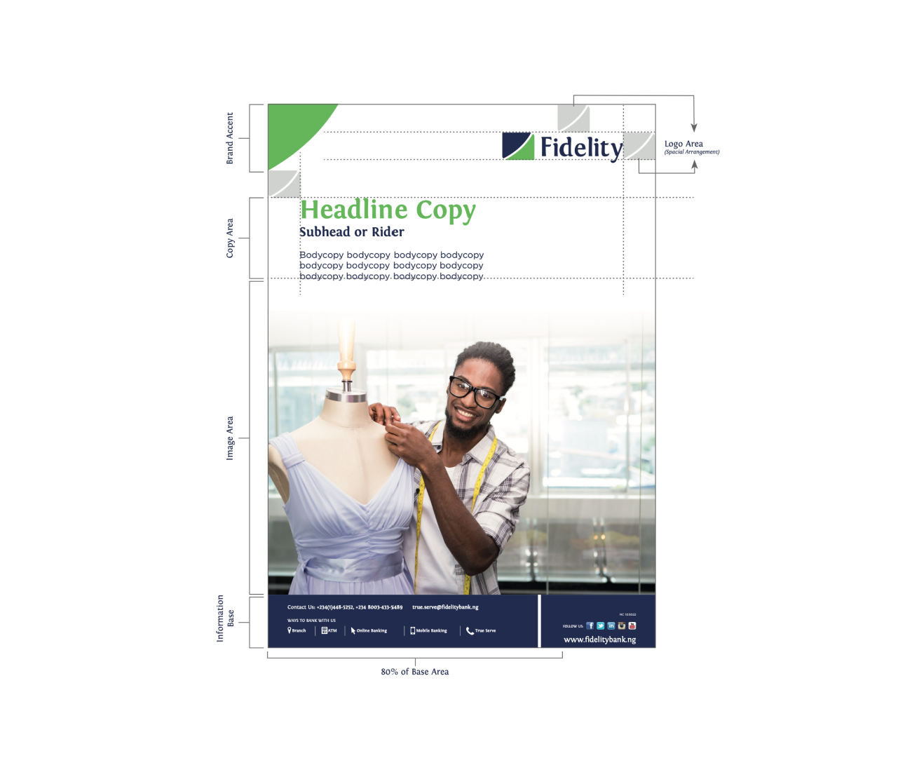
In marketing materials, the right-aligned Fidelity Bank logo adheres to clear space rules. A designated area at the bottom accommodates the graphic device for content placement, flexibly adjusting based on information volume. Co-branding seamlessly integrates other identities at the format's bottom.


Outcome
Fidelity Bank's rebrand created a unified look that captures both its long history and its forward-thinking approach. The new logo, colors, graphics, and advertising templates all work together to create a strong and recognizable brand identity. This rebranding will help Fidelity Bank stand out in the competitive financial industry.